3 Beautiful Portfolios (and why they are awesome)
Inspiration for your next step


Hello World!!1
There are a number of reasons to make a digital portfolio, a space on the web to feature the type of work you have done, who you have worked with, and even the type of work you are seeking.
Types of Portfolios
In researching portfolios, both looking to write this post and make a new iteration of my own, I have come across a few different "types" of portfolios that I will reference in talking about the beautiful examples later (and how they break the mold).
The "Hi I'm ___"
This type of portfolio is easy to spot, it starts with "Hi I'm __", has an image of the designer generally, 3-5 featured portfolio projects, then the contact footer. The upsides of this type is that they are generally very easy to spin up, and then make variation on the theme to start hosting projects or generating quickly.
ex: Ben Riggs | Designer & Photographer
An incredibly clean, usable and filled out version of the "Hi I'm __"
The Awwwards winner
This type really brings the wow factor, and is generally a more fully multimedia experience. Featuring a landing page animation and wild scrolling animations to bring you out of the web. These seem like they can be really intensive to make, and can be labyrinthine in the navigation, they are more of a web experience than navigation point. The upsides of this type is that they do a really great job of showcasing the technical expertise of the designer or company.
ex: Loïc Belaïd-Remesal Portfolio
I love the aesthetic of this one
The OG
These portfolios can be spotted from a mile away by the most out of the box, viewable, accessible style possible, as if determined to make the perfect website blush. What they lack in animation, they make up for in sheer performance and usability. Generally for designers, artists, and thinkers with more experience under their belt. Without clout and content, these can seem pretty bare.
ex: Information architecture, writing and talks by Abby Covert
A very usable and personable example of the OG portfolio
Gorgeous and Usable Portfolios
Lets get right down to it ->
Jacob Leech // Digital Craftsman
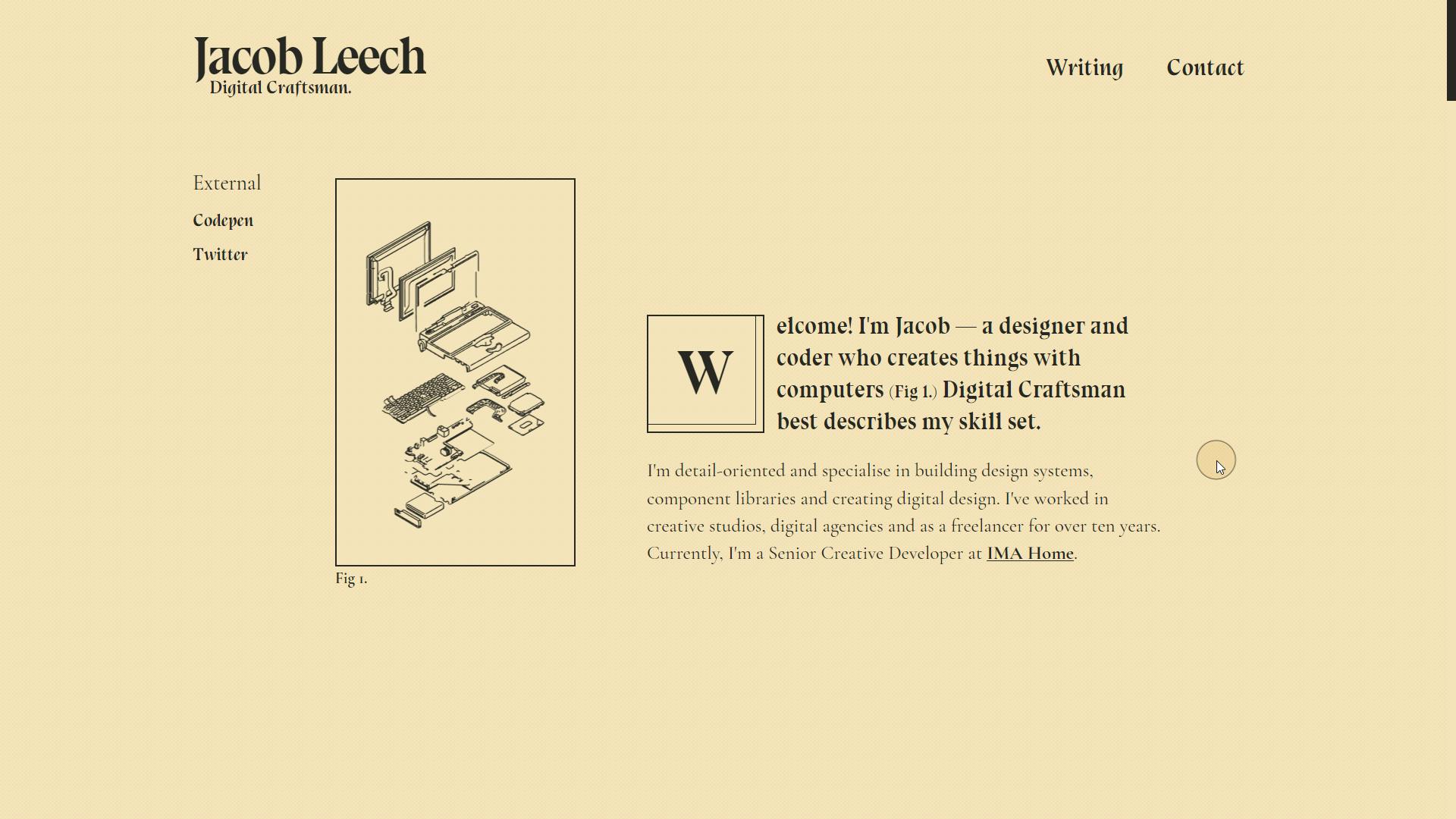 This portfolio really led me on a journey to realize I should start on my own, and thus this blog (which will probably be a part of the portfolio in addition as a place to collect my thoughts for the great spider in the web), but enough about me
 </zapp branigan voice>
This portfolio site is awesome, the animations are subtle, the structure is clear, the style compliments well the type of thinker Jacob is, and the kind of persona and brand they are conveying.
What Works
The portfolio tells a story, it tells me how Jacob thinks, it both tells and shows me what type of work the designer has done, is doing, and wants to do.
It is succinct yes conveys a ton of character, which can be said of both the content as well as the animation style. The transitions are nice, and in general, I would say the look is understated with a wow factor.
The structure is nice, theres a couple of external features for the portfolio, such as codepen and twitter, so interested parties can easily see how the designer thinks, communicates, and codes.
On top there's ways to get in touch and a blog function, with (currently) a single post, that is itself about the ideas, research, and technology stack that went into creating this awesome portfolio.
Ideas for further development
There are animated schematics here that highlight, but don't actually do anything. I think it would be cool, since they highlight and sort of transform, if they had some function on click, like coming together into a final product, or showcasing a resource.
Awesome Takeaways
Be Succinct: You don't have to include every type of technology you know, or every project you have ever done (this site doesnt actually have any directly on it) in order to make an awesome portfolio that still has plenty of wow
Be Yourself: People come to your website to get a sense of what you can do and who you are (sometimes to see if they want to work with you, sometimes for blog research). There's no sense in not showcasing what makes you passionate about the type of projects you want to work on. Be outrageously yourself.
Lean on SaaS: This portfolio is really just a short resume, a single blog post, some links and transitions. It uses codepen as a portfolio project host, twitter as... whatever twitter is, and could use #hashnode as an incredible place to easily and quickly spin up a blog to be included in the hashnode sphere as well as pulled into a portfolio (I think that's what I might do)
Vivid+Co | Full-Service Agency and Strategic Advisor
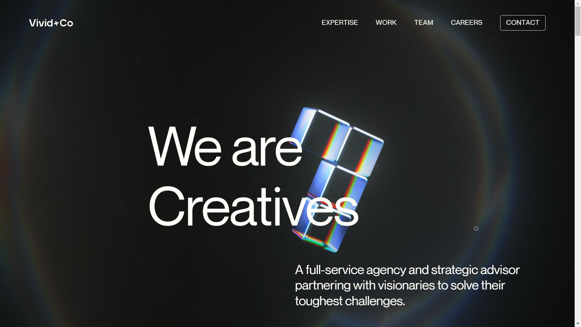 I love this portfolio/agency site. Sort of a take on the Awwwards style with the background animations, it works more like a website than multimedia experience. There is nothing here that is overdone, everything seems just so professional, yet warm.
What Works
The portfolio showcases the agencies expertise really well, not just creating a beautiful and usable web experience, but creating something that feels absolutely cohesive. The background animations work with the text, work with the animations in all the tiny details of the site.
The more I look at the site, the more I find little impressive notes that just wow me. The periods are little blocks that fill up slowly or tetris together. The nav bar has a little text hover animation.
The structure is so simple, everything the agency wants to convey is mostly on this single page, with only secondary features as almost a modal-like experience, without any external services. I would love to (and may) follow up with this team and see if they would be willing to let me ask them some questions about the technology behind the site, for science and for the blog of course.
Awesome Takeaways
Go Off: If you have the chops, your portfolio is somewhere you can shine, particularly if you have a whole talented team. Take what makes you unique, whether it is personality, technical knowledge, or aesthetic choice, and showcase that as your #1 message.
Be Detail Oriented: You may think that no one will notice sloppy workarounds, but if people will notice all the little cool details in your site, they will surely notice when things arent implemented with care or attention to detail. So do both! Make sure your site is working properly (I'll look at it if you want, wax.alchemical@gmail.com), and has some cool little details to call your own.
Don't Go Overboard: You can have just a couple projects, a couple of partners, a few paragraphs about what you are good at, as long as you do a good job conveying who you are with they design and style of the website. A clean simple website can reflect a well-ordered mind or institution.
Henry from Online
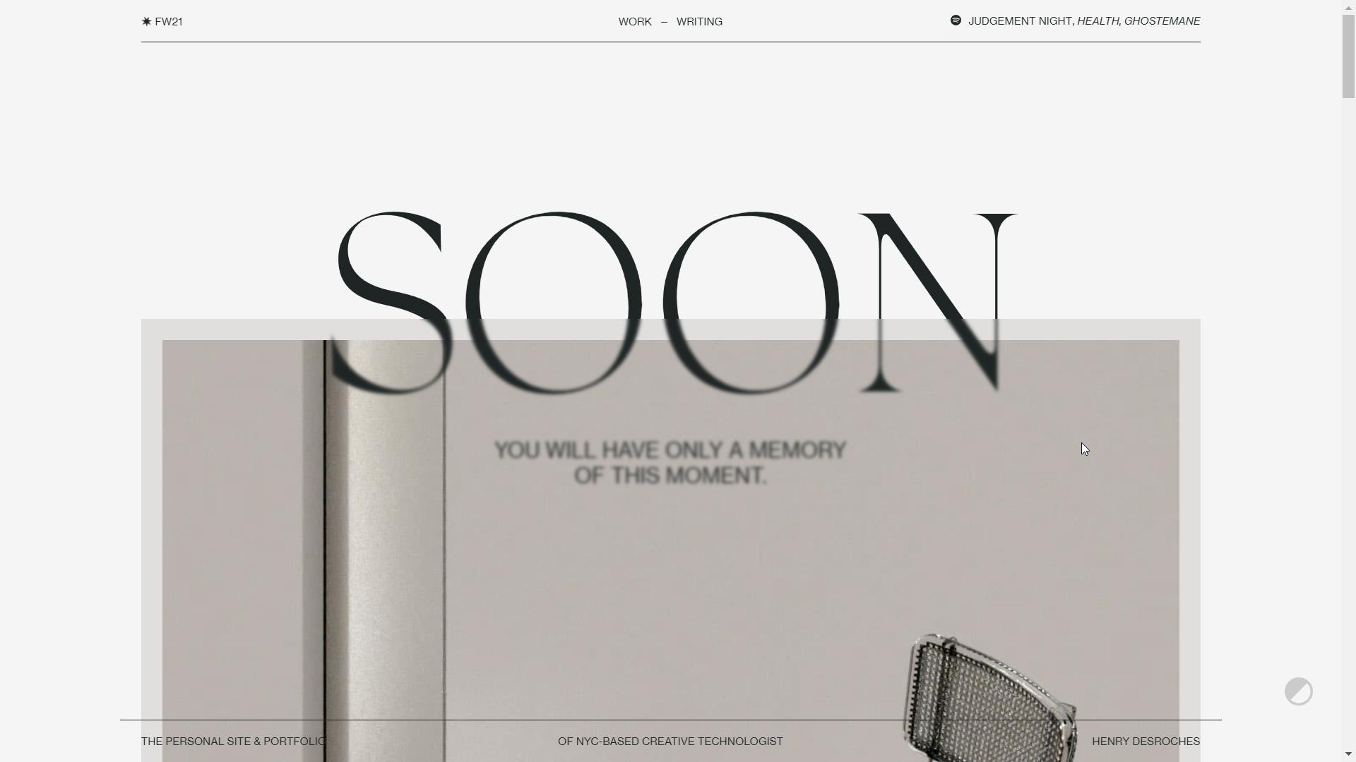 Incredible personal website that exudes personality, style, and technical talent from Eleventy Enthusiast Henry Desroches. I cant wait to see what this years portfolio will look like.
What Works
The font, spacing, minimalist animation, and simple navigation speak volumes about the designer who is very technically gifted and creative, but doesn't have to make a 30 second visual or crazy transitions to wow you.
This type of design could work with a number of agencies, by not being too overboard with the style, Henry allows potential clients and partners to imagine how he might interact/elevate with their content, without pushing too much of a pre-ordained aesthetic.
The navigation is simple, works fast, and though the site has some unexpected features, like the writing section sort of transforming before becoming available, it adds to the fully developed experience, more than it is an unexpected function.
The blog section is nice and filled out, Henry clearly thinks a lot and deeply about his projects.
Awesome Takeaways
Just Build: Make something just for the sake of it. Animate just to try something. Not everything has to be aligned perfectly, have a huge design system, or a zillion projects to be worth making.
Get Good: Sometimes to make cool things, you have to dive deep into animation and interactivity, spend a lot of time thinking about font, or practice your craft. Thats ok! A portfolio is kind of a recursive process, making it, makes you better at design and creating something. Maybe we should all take note and make a new portfolio every year!
Showcase what you are selling: In many cases we are selling our design skills or ideas in such a way as to be inseparable from who we are. People will hire you because they can't get your ideas from someone else's brain, so take your portfolio space as a place to showcase what makes you awesome.
Who am I?
Hello! My name is Sean and I am starting a blog! but um.. you can probably see that. Anyway, I am the Information Architect for a university and digital nomad and just wanted a space to share my thoughts on development and usability while I work on the projects that interest me ^^
I'm just a guy who tells you that there will be 3 beautiful portfolios and delivers 6. If you want me to look at your portfolio and give you notes or write a blog post about how awesome you are, hmu at wax.alchemical@gmail.com