


Introduction
Developers use frameworks like Astro to build web spaces, quickly.
I’m on these types of sites about every day:
These sites serve a variety of roles: from code toolkits, to learning and documentations spaces, to sandboxes and code environments, to job boards and essentially a product page for the company. They are deceptively complex, which is probably why I love it.
Overview & Goals
Astro is a javascript framework that seeks to make performant websites easier for developers to make. The particular technology is unimportant, I am interested in the learnability of the website or how easy it is for first-time users to accomplish their goals.
Astro, as a company, has an objective of drawing in new users to use their product, an extremely technical building tool, and are attempting to sell their product as “easy”. Simply put, if a developer has a bad user experience on the site because it is unfriendly to new users, they will leave and are unlikely to use this “easy” framework.
Astro bills itself as a modern development experience.
- The website should allow new (to astro) developers to get started and learn about some of the basics quickly.
- The documentation should allow for research into some advanced topics in the framework.
- They advertise that they are funded and looking for developers . The website should allow for potential candidates to find open positions
My goal for this post is to examine this website to generate insights about the learnability of this framework website and perhaps to glean some design guidelines for these types of framework websites in general.
Methodology
To test the learnability of the site, I am utilizing task analysis and having some representative users do some think-alouds, which are common methods of user testing.
This involves getting five (The Magic Number) or so representative users to talk (/think) aloud while they try to complete representative “tasks” or activities.
I process my think-alouds much like Paul Marty’s Usability@90MPH, which involves some getting some representative users to test an interface by having them complete some tasks or activities designed to test some of the objectives of the interface.
Basically user testing doesn’t have to be daunting or complex. People will literally tell you what is wrong with your site. The better you design these activities the more you can glean from these tests, and there is certainly an art to the design, but if you like talking to people, the testing is not arduous at all.
For more information on developing these activities or scenarios, see:
- Turn User Goals into Task Scenarios for Usability Testing by Marieke McCloskey at Nielsen Norman group
- Mary Beth Rosson and John M. Carroll, 2009. Scenario based design
Representative Users
This type of framework isn’t for new developers. I’m looking for developerss of a variety of experience levels with no familiarity with Astro.
activities
These activities are drawn from the goals of the website outlined before, and are meant to test some of the dimensions of the website such as the home page, the “docs” and job information.
- You have a job interview coming up and you would like to build a portfolio, a colleague tells you about a framework they are enjoying, Astro. Navigate to the website and explore that as an option to build your portfolio.
- Partial Hydration in Astro is a main selling point that some developers have been talking about, and you would like more information on what exactly that is.
- You teach a React class, where you use a React framework that sounds similar, called Next. What are the differences between Astro and something like Nextjs?
- Astro has recently received funding and is looking to expand, look for what positions are open at the company.
- You want to have a list of your blog posts display on your Astro page by tag, how would you make that type of page and ensure it was rendered?
Key Insights
the first scenario
In exploration of a portfolio site, I imagined my participants would end up at one of the sandbox environment centers of the site, of which there are two pretty large portions of the site dedicated to, the Themes section, with a portfolio Theme:
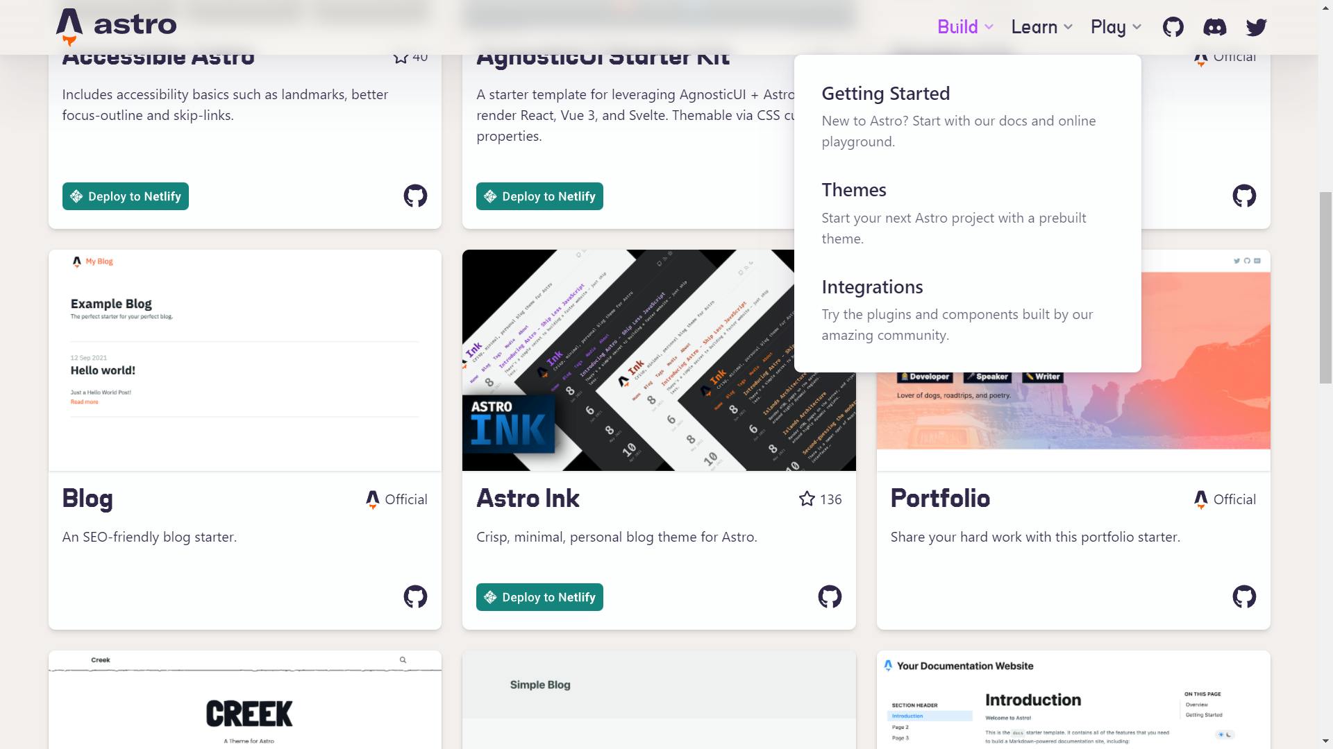
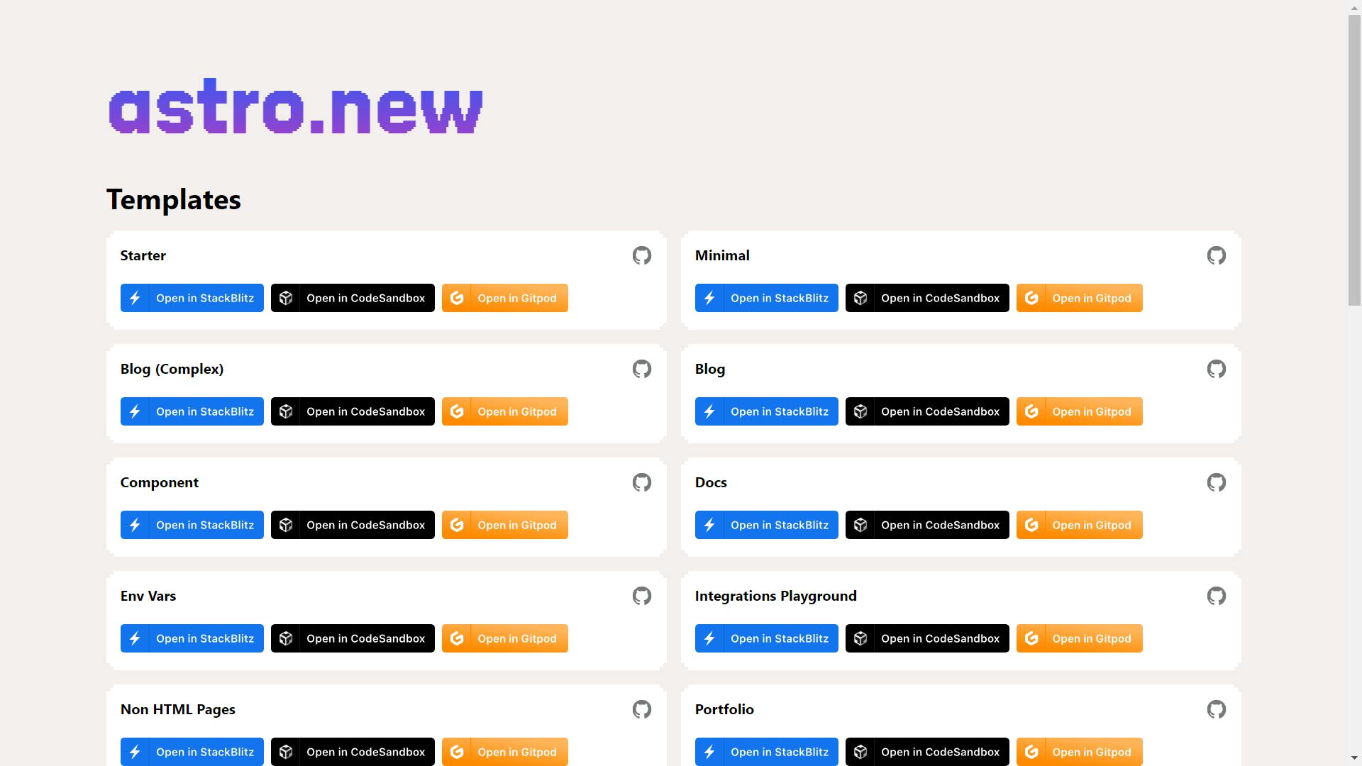
Or the Play section with a bunch of push-button-build-type sandboxes ready to spin up and mess around with in the browser:
However, people tended to gravitate towards the Docs after perusing the front page for a little bit, trying to find out general information about what Astro was. That tended to blend with the following two scenarios concerning the “Partial Hydration” feature, and the one about “React” similarities.
- It might have been better to give more background into the service before participants tried it, but it behooves my research to hear how participants answered their own questions utilizing the site.
- I’m not interested in benchmarking the scenarios, only in better understanding how people learn about, navigate, and use this type of site, so seeing that conflation was actually really helpful in understanding the information seeking behavior
in exploration of the site
I’m looking for this thing to tell me exactly what it is .. still don’t know what it is..
The first thing people seemed to want to understand when viewing the new information space was what exactly it was.
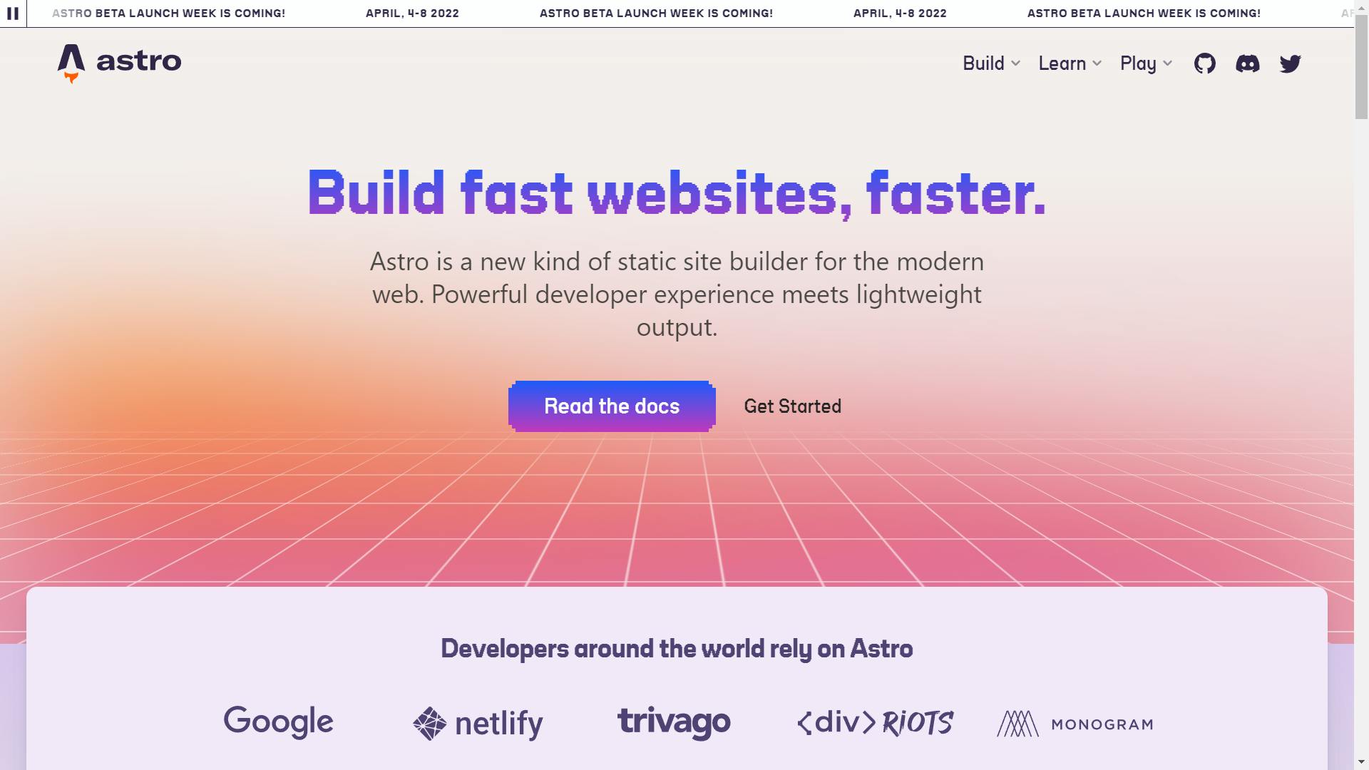
The Astro site doesn’t put it in simple terms, aside from the main headline, which is non-specific about “fast websites”. The proceeding subtitle is filled with Jargon, and the next large eyecatching space has to do with namedropping partners.
The next space has a loading demo, showing just how much faster this technology was than the standard. And something very interesting happened here. No one watched it. It wasn’t fast enough. When faced with these loading elements, everyone seemed to look at the loading spinners for a second and read the next section.
on wayfinding
At least this get started button worked... and now I don’t know what I’m looking at
The above quote is in reference to the menu being buggy on Safari. I don’t have an Apple to test further, however it also highlights some issues with the site language in general
Though the navigation is in simple terms, it didn’t seem to match up with what participants expected, either through the top navigation bar, or through the links and calls to action, like mentioned above. Strangely, the Get started button on the front:
leads to the live deployment section, aka the "Play" site seen in the above section.
It seems like most people thought it would lead them somewhere they would:
- Learn more about the basics in simple, non-jargony terms, or
- Show them how to download or initiate the code to get started with the product
Play maybe?
First thing I like to see is demos
The above quotes highlighted some interesting issues some of the participants had with the navigation. People didn’t really seem to know what Play meant, and they would go there at different times throughout the test, but not during the Portfolio scenario, where it would have informed them of that process.
However people did want to see “Demos” and other analogous terms for things that were in the Play and Build sections of the site. I think the site may benefit from further taxonomy study in general to understand what people may call different parts of the site, and how better to arrange that information to help people find what they are looking for.
guess ill go to the documentation
Guess I’ll go to the documentation
A lot of developers seemed to gravitate to the “Docs” when the answer to a scenario wasn’t readily apparent in the top navigation bar, which is generally a big knowledge base in these types of sites.
The docs are easy to get to. No one missed them, yet, paradoxically, if you click the Docs button, you end up on the Get Started page, in contrast to the Get Started button next to it taking you to the Demos.
Aside from Partial Hydration, my participants seemed to have a hard time finding what they were looking for, a hard time knowing how to start finding the tools they needed to understand the terms they docs were using, and a hard time knowing when they had found what they were looking for.
This is a really big area of the site, and this section could easily bear user studies and iterations on its own., so I will just offer a couple of observations.
Why would I also need a framework?
I want to see what this renders as
The combination of the front page and getting started section of the docs didn’t seem to inform users well of what Astro actually was. In fact almost no users came out of our session understanding the nature of the product the site was trying to sell or why it might be useful for them. For some of the sections and pages of the documentation, and some of the examples of functionality, people expressed wanting to see what something looked like, though much of it is links, text, and code exclusively.
The last scenario has a specific page in the documentation that explains the process of a “Tag” function, though obviously I was just interested in how users explored that question in the docs, not if they could find the page. Some people would find the page, skim through it, and move on to another page.
People would try the search function, and I don't believe anyone successfully found what they were looking for utilizing either it or the Find function. One user went to the Astro Vs X page to search for the comparison to Next JS scenario and couldn’t fund it, not because it wasn't there, but because there were 27 instances of react on the page, which the user didn't want to filter.
big wins
Not everything went poorly, there were a couple of the activities that the users completed easily.
Partial Hydration
There are references to this function on the homepage and a whole section called “Core Concepts” in the documentation dedicated to it. People had a hard time understanding what it was, but not finding information about it to study if they really wanted to.
Job Postings
Everyone expected these to be at the bottom of the homepage, and that’s where they are. I’m not sure if that’s because it is a common web convention, or because all of my participants were (purposefully) developers.
Recommendations
1. lead with examples
Not everyone is the same type of learner, or has the same type of strengths. People can more easily get up to speed with your taxonomy or more complicated processes by showing them examples. Participants seemed to want visual examples to understand the framework in general, and the ui components, as well as some of the documentation and more “code-y” parts.
An example of a site that does this well is Bootstrap. On the Bootstrap Framework homepage, they have an Examples link, that takes you to a page with web based examples to look at and try.
In the documentation as well, they have visual examples with most sets of code
2. put things in simple terms
Not everyone is at 100% of their maximum mental capacity 100% of the time (like while tired at the end of the day or slightly distracted holding a puppy or something). Putting things in simple terms helps people understand the product or the message you are trying to send with your information space.
A lot of developers in this instance are going to go to the documentation to try and understand core concepts and selling points of products like this. It benefits the bottom line to make this knowledge as accessible as possible.
Eleventy, a similar framework does this well. They don’t really bother trying to explain the whole of Jamstack ecosystem and why you might use the product on the homepage. The do have a giant docs button:
That takes you to some really well explained documentation with a great search function. The next page is a glossary to help familiarize users with the nomenclature eleventy uses.
3. decide what your message is
When making a site to sell something or encourage use of a product or service, decide what the main point or top three messages the site should be. The information space should help users learn and understand this message as easily as possible.
Some of the most valuable space on the site is at the beginning of the home page. Many framework sites like this one for Nuxt have architectures what this message seems to be as the first three sort of slides or 100% view width sections of the site, being:
- It’s Intuitive
- It’s Easy to both learn and start
- It has a lot of features you might want
In contrast for Astro, the top three “slides” on the homepage seem to indicate
- A mixed message of fast websites, building fast, powerful and lightweight, modern but with a retro look
- We are legitimate
- We are fast
In this instance, I’m not sure if this is the message Astro wants to send, or if this should be their primary messaging to potential users.
4. let your users name things
In development of a space or service, you can sort of go blind to your own knowledge of the system and the information architecture. That is to say, you are not your users. You may understand the system much differently than your average new learner of your technology.
Further testing of the navigation through things like Tree testing or Card Sorting can help uncover how users understand and name things within the structure or navigation of your service. It can help uncover issues with not only how things are named, but how things are arranged in your space or navigation.
The Nextjs site is an example of a more intuitive nomenclature and navigation pattern, it is a very flat type of navigation where each site module gets its own sort of microsite. It is not only named in a seemingly more user-friendly way, but easier to understand how the parts of the site relate to each other in general.
Conclusion
As a newer framework, Astro faces a lot of organizational tests and challenges to their business from both a product development and user experience standpoint. With only five participants and a notepad, it is easily possible to let representative users of the product inform researchers or designers of issues with the space, and describe some possible better practices for these types of information spaces moving forward.