
In an attempt to continue my “Learning in Public” (by swyx, also see Working In Public by Chris Coyier) journey, I would like to share a little more about my work with pe5tle, a little image-data-manipulation and rendering platform written in javascript I created as part of a hackathon.
Conclusions
After doing a little research on the context of how users were using my image-glitching platform proof of concept, and considering some of the usability pain points, I realized several things:
- The whole UI needed to be pared down
- The navigation between glitch functions needed to change, particularly on mobile
- More controls needed to be taken care of on the back end of the application, or split into different “glitch types”
This writeup will describe my process in deriving what some of the issues with the UI are, ruminating on solutions, and show some proposed prototypes for the next iteration of the application.
Prototyping & Design Workflow
When I was in grad school I utilized Balsamiq to do wireframes and prototypes, to sketch out ideas and put two ideas next to each other for comparison. When I lost access to it afterwards, I started prototyping in MS Paint.
It worked great, I was creating everything from quick sketches to Hi-Fi wireframes in it. However in terms of flexibility, speed, and interactivity, I have been missing more advanced interface design tools, so I have been reaching for Figma lately, a sort of collaborative, apple-style, prototyping and designing tool.
How Figma is Helping me
I find that if I separate the design in development process, both are cleaner and faster.
That is,
- I can iterate much more quickly in a design space than I can with coding, and
- no matter how fast at designing in the paint, like in my development environment, I seem to be able to go, it’s always much faster if I have a design document to look at while developing. And
- I can get stakeholder feedback and do some user testing without spinning up a development environment or pushing code
APM - Actions Per Minute
I was watching someone play a game called “Age Of Empires IV” on twitch on winter break a couple months ago, and Real-Time Strategy (RTS) gamers have this idea of Actions Per Minute, I learned. Which is the idea that pro gamers take a lot more actions in a shorter amount of time than newer players.
They are very “clicky”, these pros, but Actions per Minute, seems to come generally not from how fast you can move your mouse, or knowing all the hotkeys, but from knowing what to do next.
When I use prototyping tools, it helps me to know what to do in the next steps and increases my actions per minute, just like the pros.
Current State of pe5tle
One of the difficult things about Learning in Public is having to show a product in-development, in a less-than-finished state to others.
I think when we watch videos of people making internet spaces and products online, they follow a more logical process than real developers take with all the bugs and side-quests and learning that happens in making that logical workflow. So let’s get embarassed:
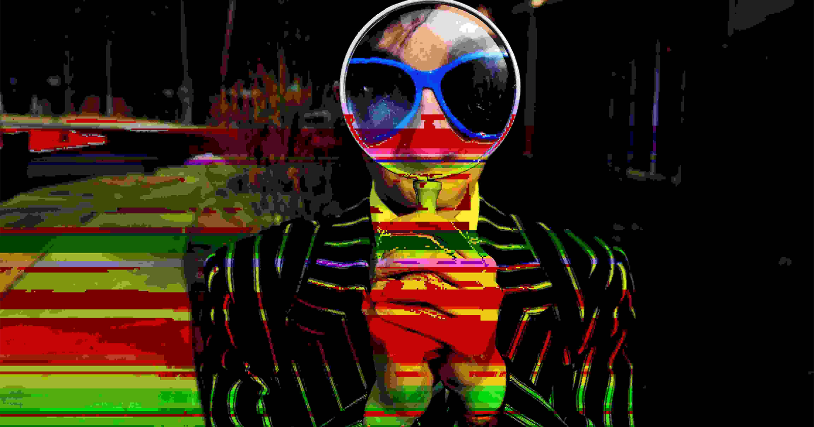
What is pe5tle?
It’s a glitch art image application. It makes generative art by manipulating the data in an image and allowing the user to mess with that data, blend it with the original image, and save the output at original size.
Mobile and Desktop User Stories
Originally I envisioned this as sort of a Desktop experience, and was happy with what I launched for the hackathon. However I have come to realize, in general, most of the users I have presented it to, want to utilize it as a mobile application.
I turned to a colleague and looked at their pixel-sorting project, and wanted to see how they handles something similar and was greeted with a message:
This application doesn’t run on mobile devices
And I thought, maybe I should just sort of say “I intended this to be used on the desktop” and continue making the platform that I wanted to build. Overwhelmingly when I sent it or offered it to users, they immediately loaded it on a phone and tried to utilize it on pictures on their device, including these 12 megapixel phone images that caused a lot of issues in the application.
I wanted all users to be able to use pestle, regardless of context,
So I had two User Stories:
As a Desktop User I can load the 3 different Image Ratios (Square, Portrait, and Landscape) and have lots of control over the image.
As a Mobile User I can load the 3 different Image Ratios, and have a pared down interface and a large view of the image I am working on.
These two user stories aren’t exclusive and will sort of guide me as I try to propose some UI fixes in my prototypes.
1. Issues with Image Sizes & Ratios
There are 3 sorts of images that the interface should handle, and that has to do with their aspect ratios, or sort of the “shape” of the image:
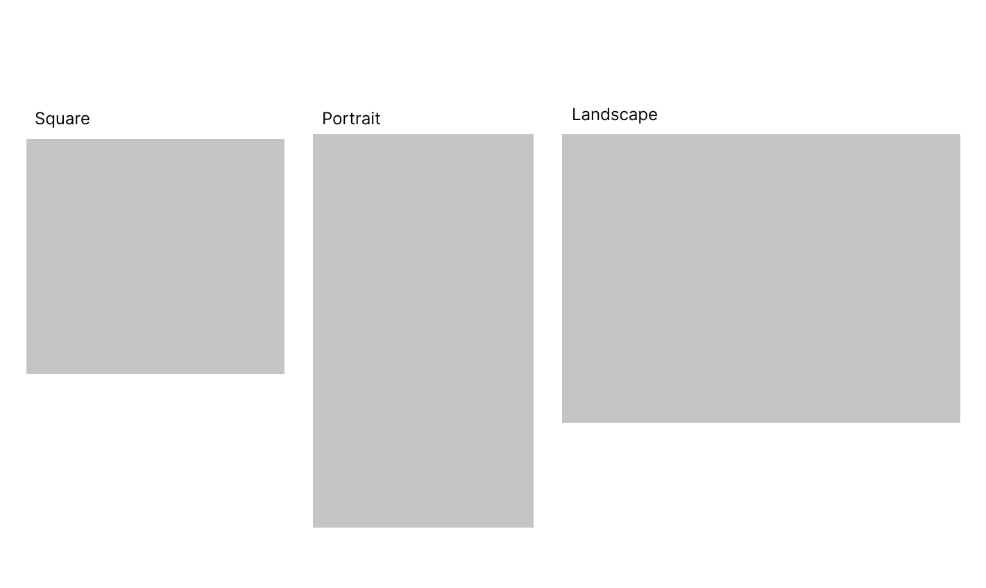
So the Issue is, how do I best accommodate these common patterns in the interface? How do I arrange the layout around these in the most unobtrusive way?
For the solution, I would like to fit as much of the image as possible on screen in desktop and phone (portrait) mode, and I would like for images that share the aspect ratio of the screen to be the entire screen, possibly.
2. Issues with Controls
Another major objective of this critique is to decide:
- How I want to arrange the controls in the layout that best supports the largest image
- How much control I should give to a user versus how much I should hide in the programming or split into a separate “glitch” function
Layout
Currently, they are simply arranged in a column on desktop or in a sticky footer on mobile. I didn’t exactly chuck them on there, but I also didn’t give absolutely full consideration to what might be actually useful to people, rather than giving out absolutely every function the platform could afford.
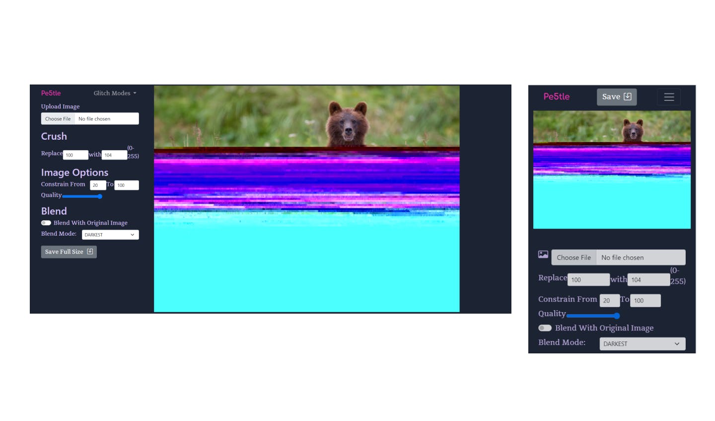
User Control vs Paring Down the Interface
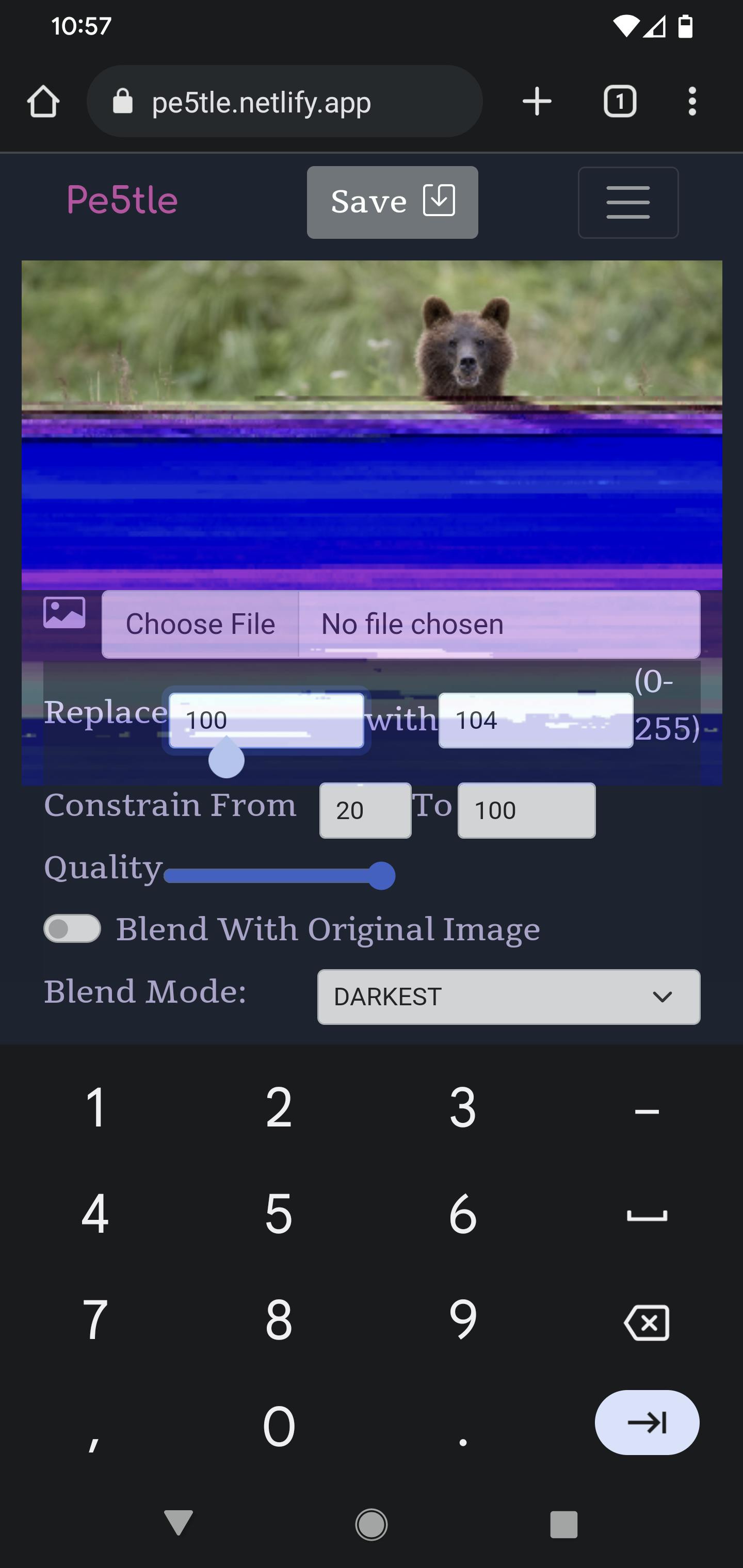
For Instance, the image above shows the “Crush” Function. This function runs a find and replace function on hex bytes in the image data. In the image above, users can find any byte (0-255) and replace with the same range. They can change the input quality before running the find and replace, which changes the effect a lot. Users can then constrain the finding and replacing to a certain percentage of the image, and choose whether to blend in a number of ways.
That’s a really flexible set of options for one “Crush” Function, resulting in millions of combinations. The opposite type of thinking might be to have one slider that represents only one of those fields in the replace function, and setting the other to a random number when the glitch type is called (unseen to the user who will never be able to set it). For the constrain function, I can assume either the default of 80% (or possibly bump it to 100%) unless called by the user, and then the second field is automatically the end of file (100), and the user only controls the first parameter, the start of glitching in the file.
The quality control could be removed, and another “Block Crush” or some-such glitch mode can be created with a similar search and replace function as “Crush”, just at low quality.
Dealing with User Input
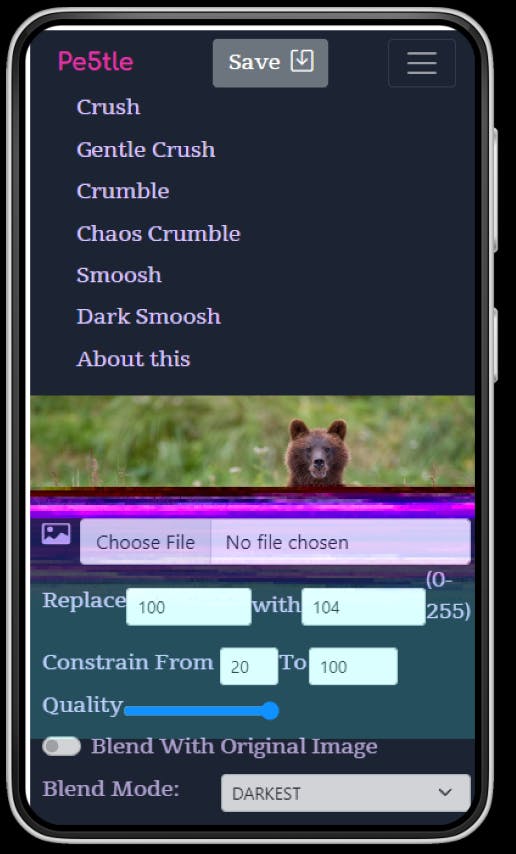
Furthermore, when a user types on mobile into an input field, it pushes the entire bottom menu to cover the image, and basically the entire screen:
And the typing is .. hard, at least for what the use case seems to be, typing a random number. Even thinking the number is kind of a task, what if all effects were slider based? Then a user would no longer need to type or even think of a number to enter.
Solution Objective
For the next iteration:
- I would like to reveal functions as necessary, or called on by the user
- Make these functions as unobtrusive as possible
- Replace some of the verbiage with iconography so that users can begin to recognize functions in a succinct way on the interface.
- Change the way some of the glitch types are controlled to avoid pulling up typing functions
3. Issues With Navigation
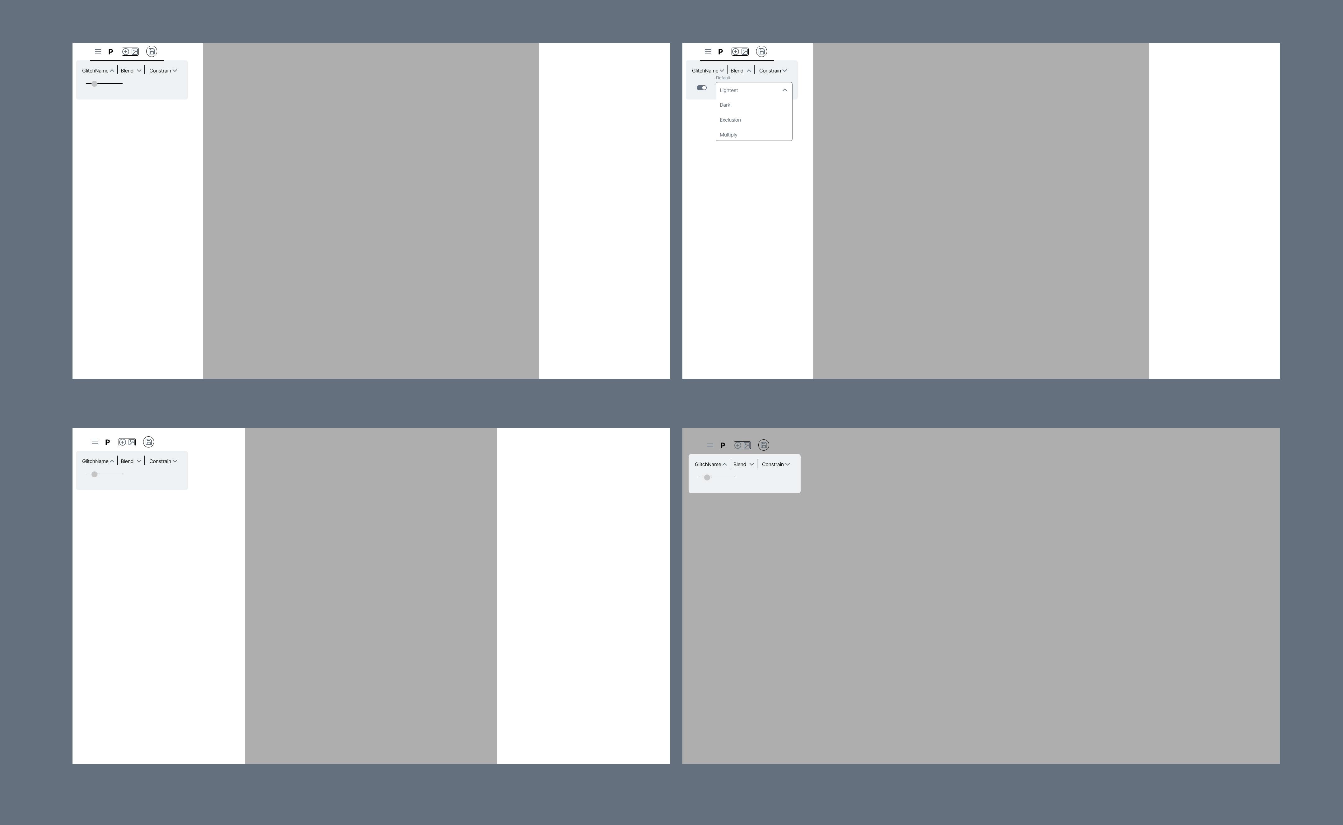
The last objective of the critique will be defining a different navigation behavior to offer the glitch modes and about view to the user. Currently the dropdown on desktop is adequate, but on mobile, it moves the entire image canvas down.
I would like to think of another solution. Perhaps some type Offcanvas or curtain menu solution, so that when a user is looking at glitch options, the picture and controls stay in the same place. This will go hand-in-hand with the other two objectives of layout and control features.
4. Technological Issues
I created it in a limited time during a hackathon, and the way the site works in general could be improved upon. Right now, if something is adjusted (screen size, a control), the image is taken and put through the “setup” process again: take two versions of the image, turn them into an object that can be rendered on HTML canvas, glitch them and resize/center them for display.
Rather, I would like it to only load the image set (glitched image and original image for blending) once and run the “draw” function or glitch and resizing function only when the controls or parameters from the user change, rather than the loading again, which is the bulk of the computational power.
The Good News is that I have this mostly working on a feature branch on my local environment
The Bad News is that it is kind of buggy and I am looking at refactoring the project a lot to get this in 100% working order.
After that, I think I will be in a place to start building out an array of actions of sorts, allowing users to go back and forwards in their image-crushing process (which means more UI elements possibly), but I don’t want to get ahead of myself for now.
Prototypes for the next Iteration
For me to iterate my own designs, they don’t necessarily have to be high fidelity or have a large amount of interactivity, so these are just some quick sketches:.
Each Desktop View shows an aspect ratio of a different type of picture, as well as another panel (in Desktop) with a square picture, and what they blend mode might look like.
I did the same for mobile and added a frame of the slide-out navigation function:
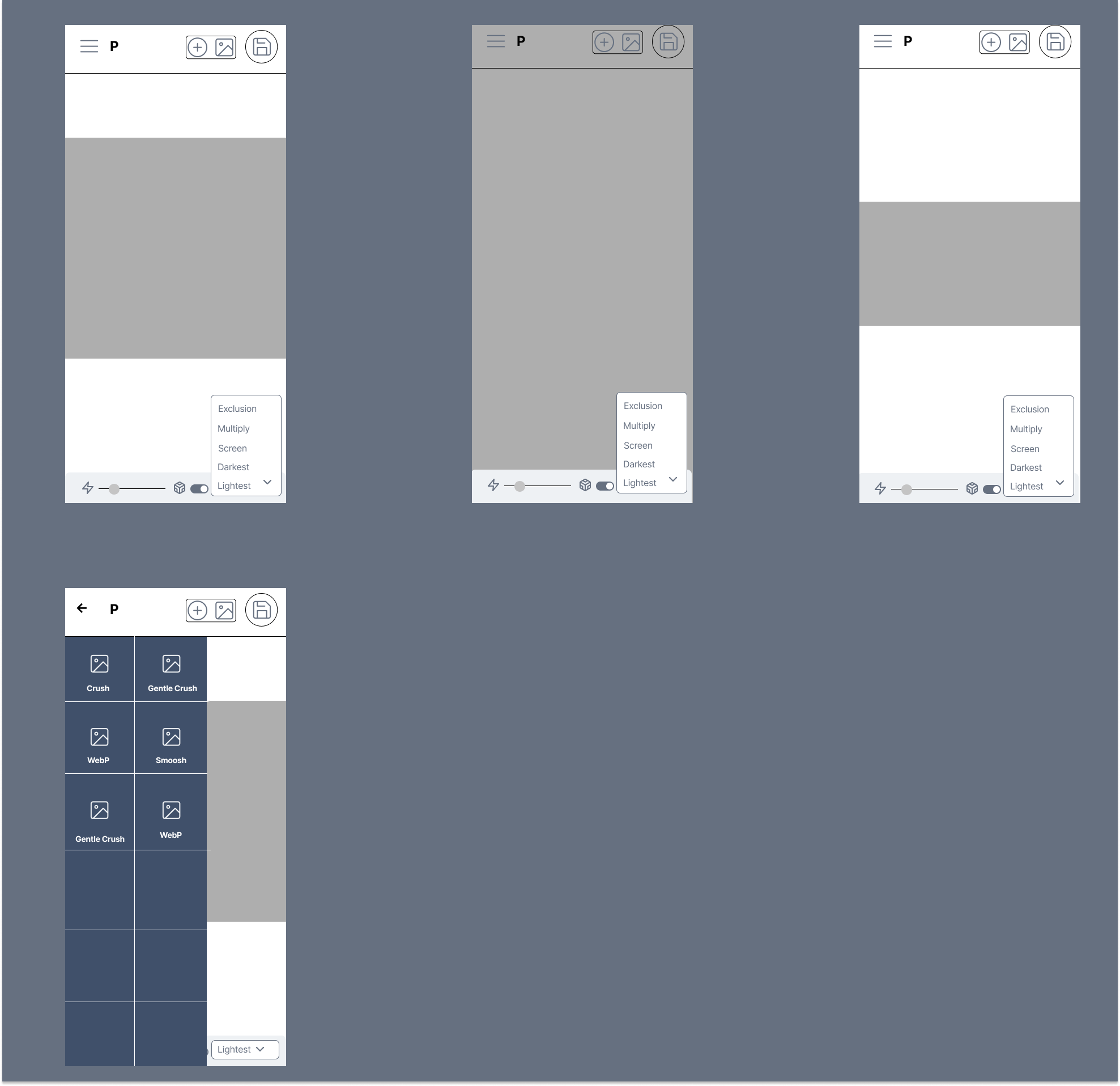
For now, it seems like the constraint function doesn’t fit on the mobile interface, and I’m considering adding another level of the mobile form fields, or taking it out of both interfaces.
By making the navigation and control elements smaller, and less available all the time, but being able to be called as needed, I hope to improve the UI a little bit and make it more workable on mobile devices, and a more pleasant experience on Desktop.
Who Am I?
Just your average iteration enjoyer here! I hope I have shared a little about my thought process in making the next version of pe5tle and how I think about wireframing and solving design issues.
If you have any questions feel free to reach out at wax.alchemical@gmail.com or on LinkedIn